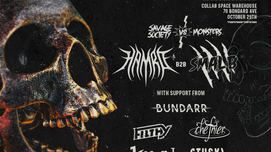
The scope of this project was everything from the ground up. I was able to build a consistent brand across everything visual.
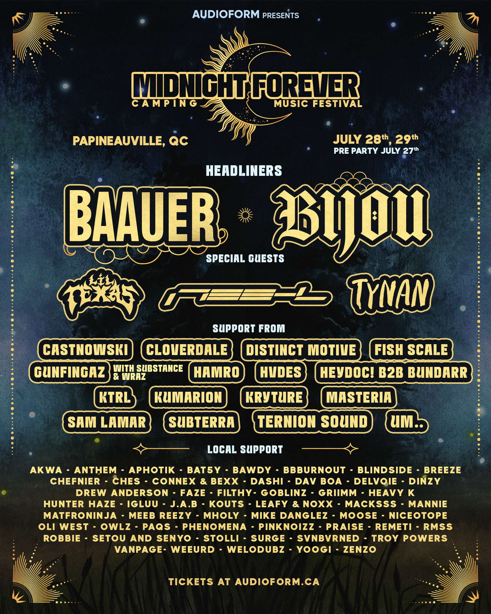
Main poster
Because of the size of the lineup, the amount of dates, and all the other information, it was imperative to show the right hierarchy of information through the main design without making information hard to read
Weekend Schedule
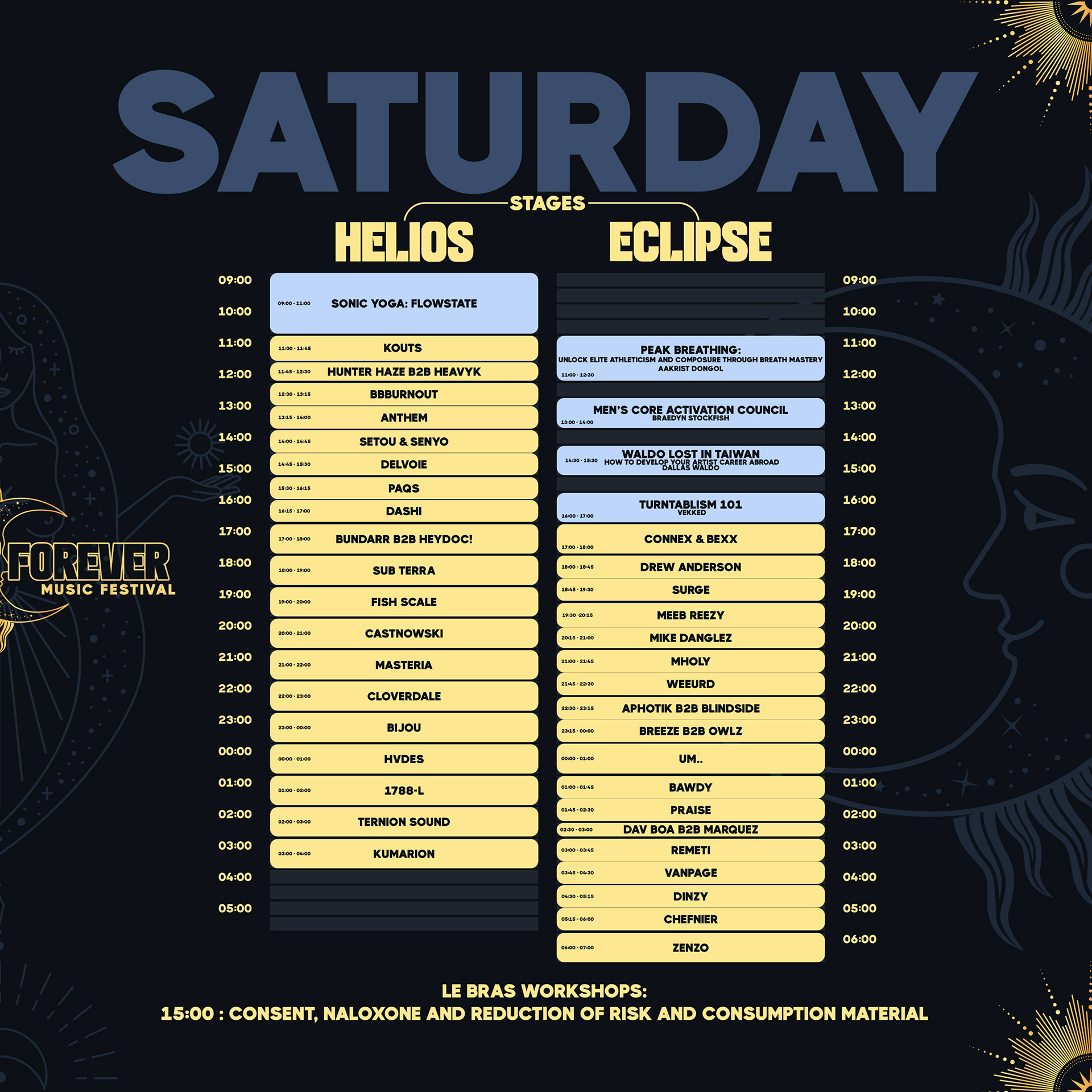
for the schedule, i wanted to create an asset that could be posted on Instagram as a seamless carousel post. this would intentionally guide users to swipe more naturally and access all the information they needed right away.
once again, organizing information was imperative so i decided to make workshops a light blue color, while music performances a light yellow. this would add an extra layer of comfort and accessibility while reading the schedule

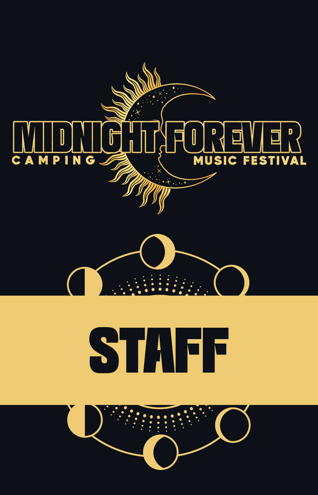
Festival Credentials
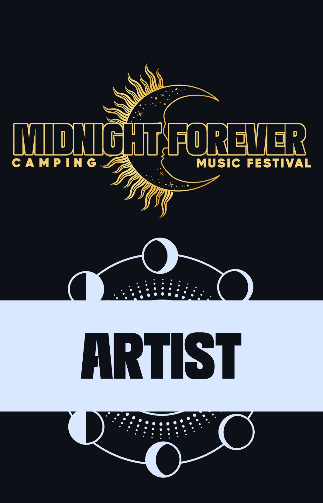
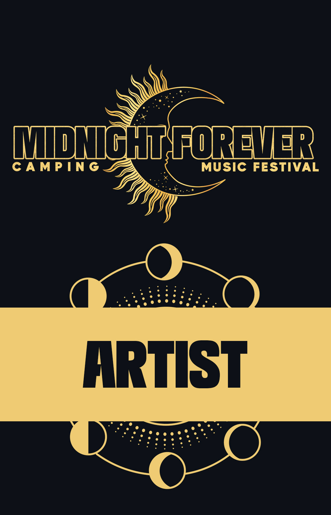
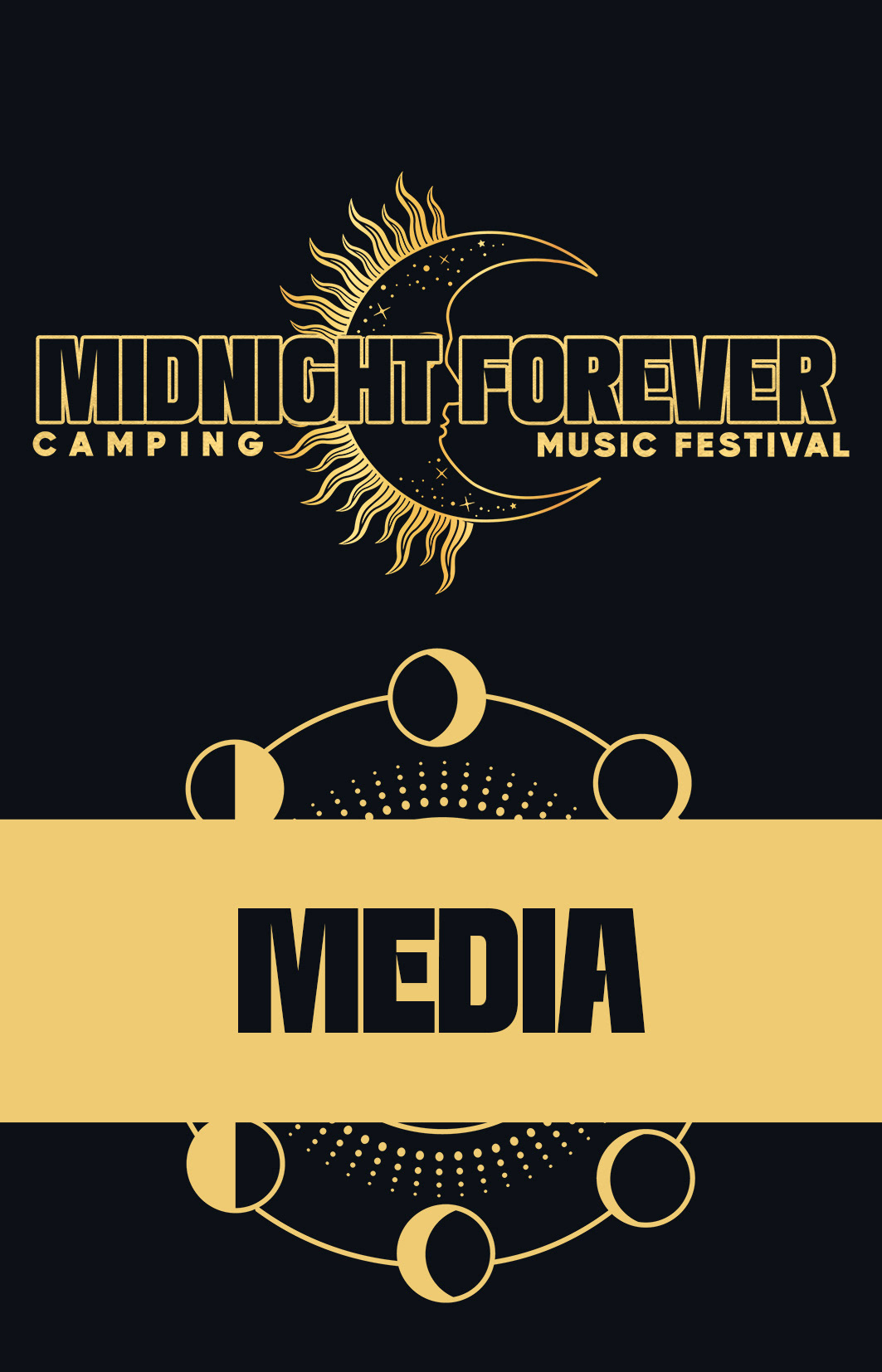
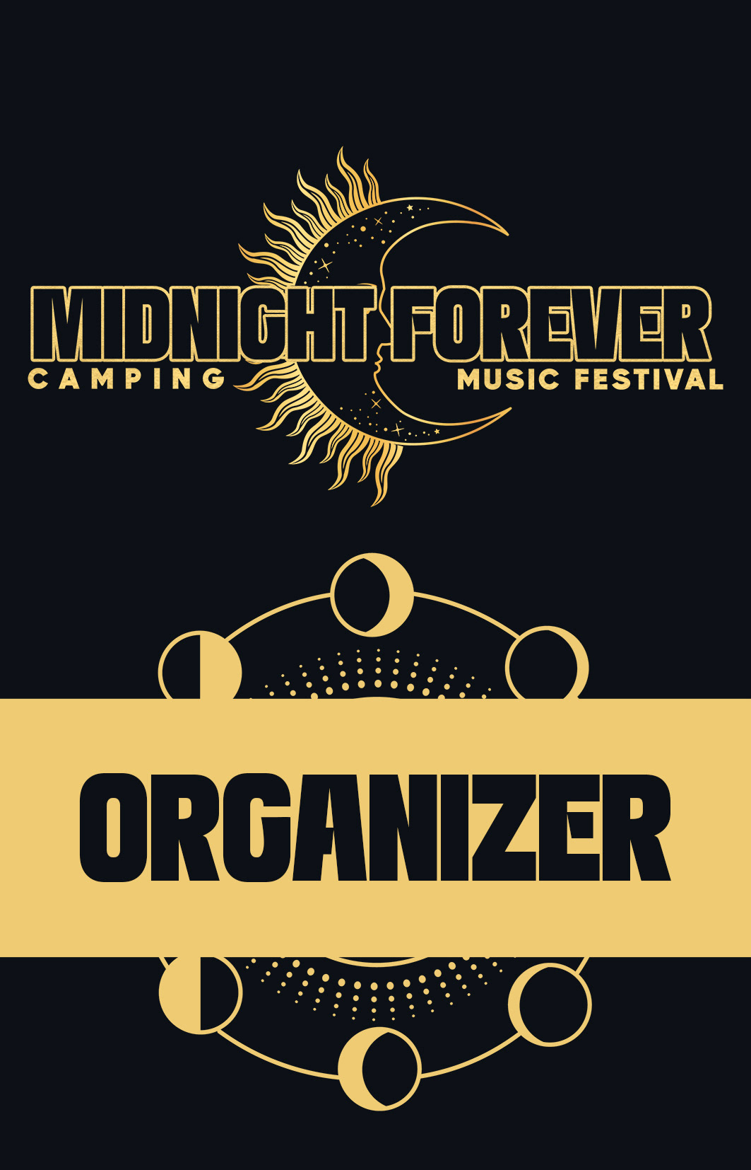
Because i had already used colors to create hierarchy of information, i used the same colors to create a hierarchy for the credentials that would be easily recognizable for ground security. Yellow meaning all access and light blue meaning restricted access
Wristbands
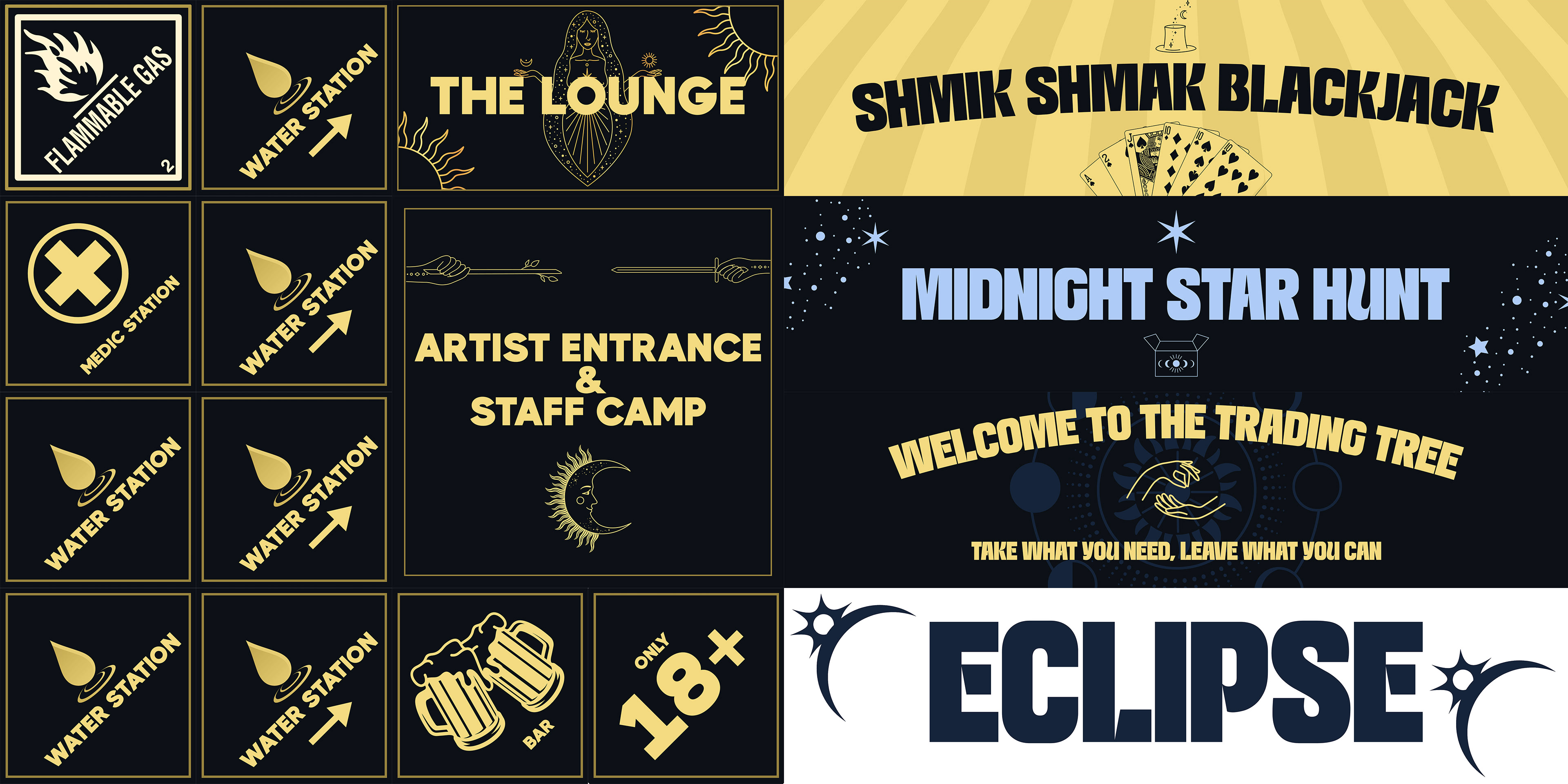
Miscellaneous Signage
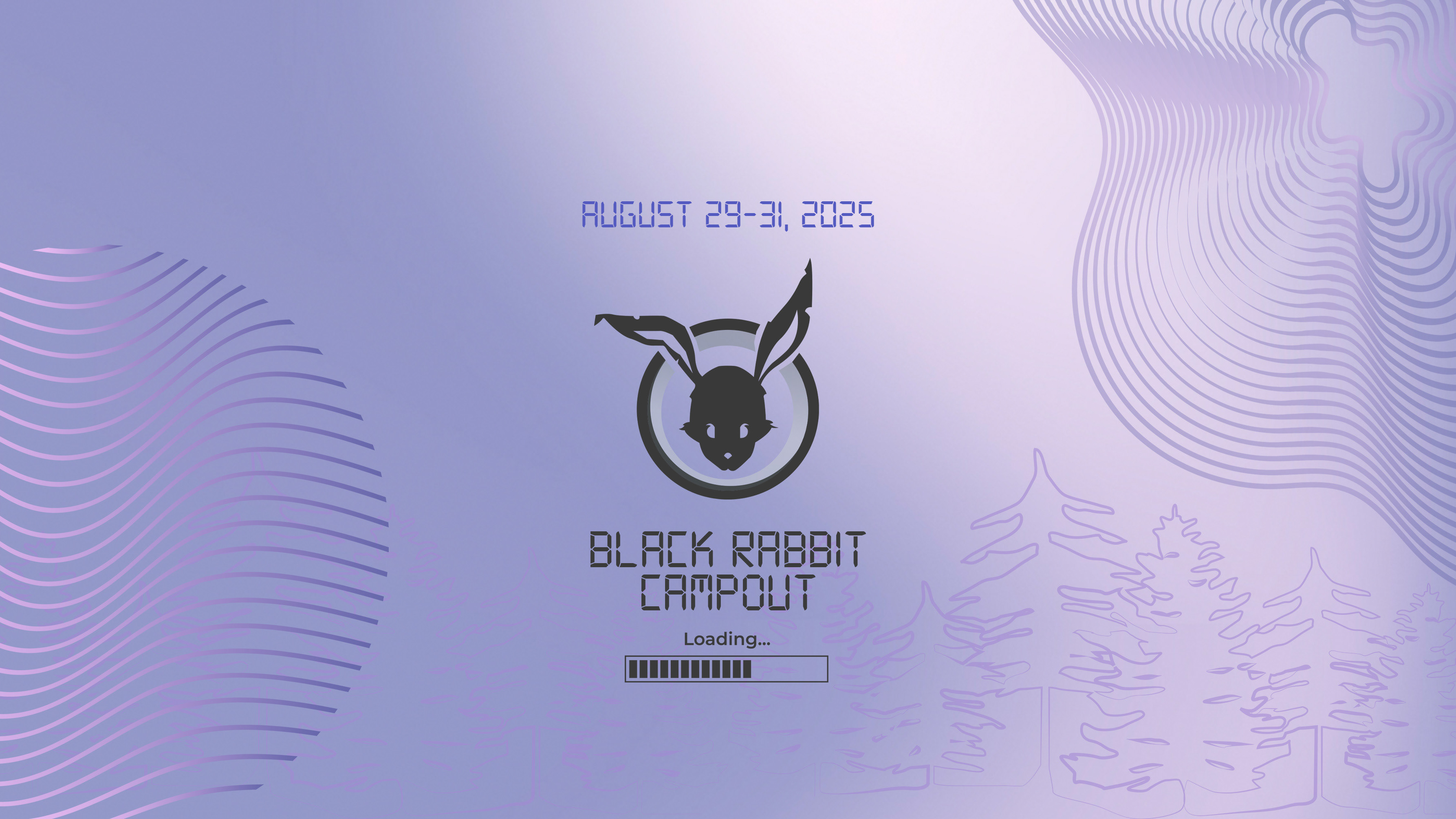
Logo in different aspect ratios
